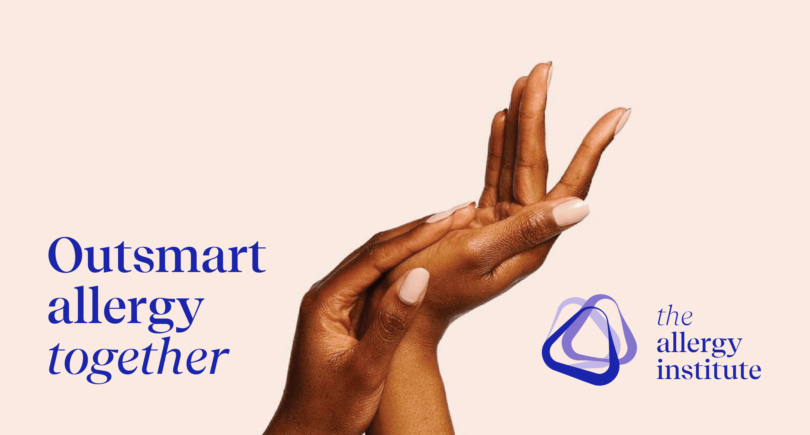
Establishing a leading institute for allergy care
In the complex world of allergy care, knowledge is scattered, collaboration is rare, and awareness is low. The Allergy Institute set out to change that, by becoming a central, independent hub where healthcare professionals can come together, share knowledge, and shape the future of allergy treatment. A bold new initiative, rooted in the medical field and supported by ALK, but designed to stand proudly on its own.
Services
Brand strategy
Brand portfolio
Manifest & pay-off
Visual identity
Art Direction
Photography
Website design
Establishing a leading institute for allergy care
In the complex world of allergy care, knowledge is scattered, collaboration is rare, and awareness is low. The Allergy Institute set out to change that, by becoming a central, independent hub where healthcare professionals can come together, share knowledge, and shape the future of allergy treatment. A bold new initiative, rooted in the medical field and supported by ALK, but designed to stand proudly on its own.
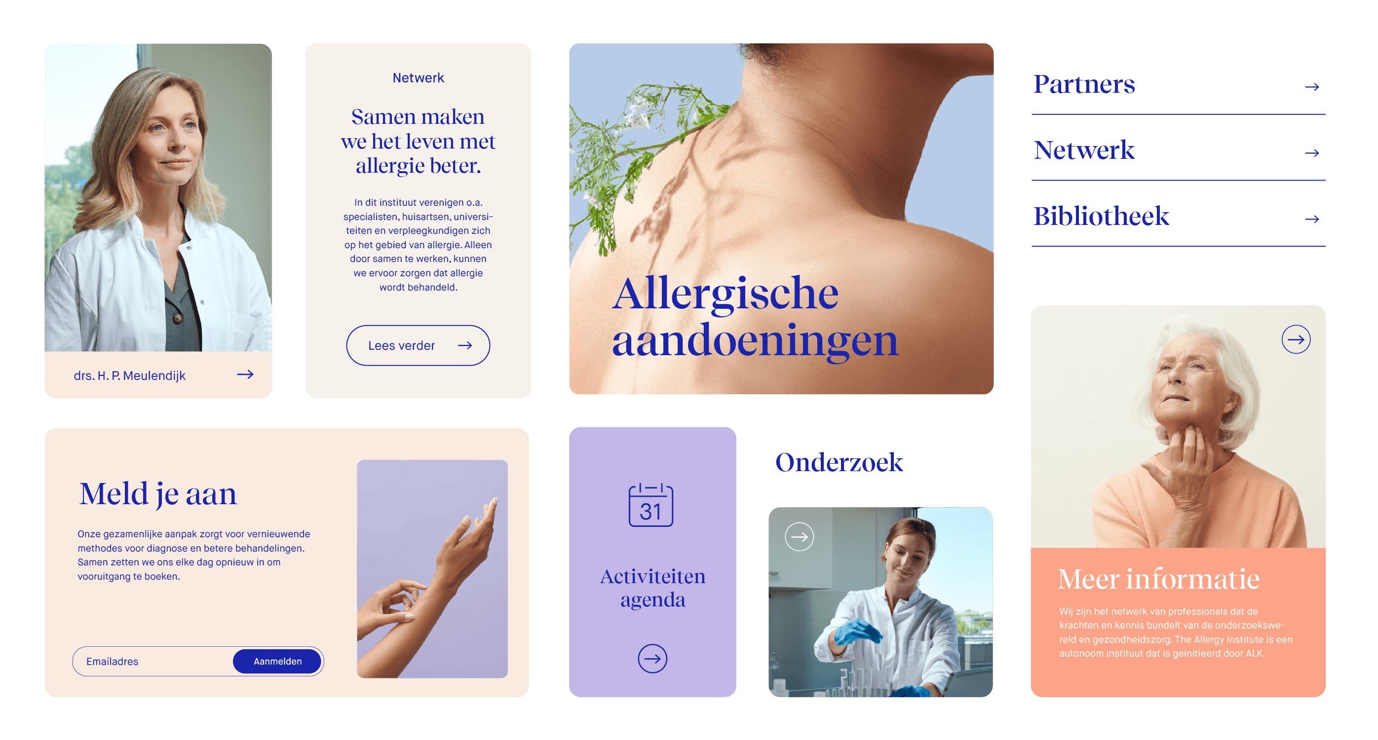

What we did
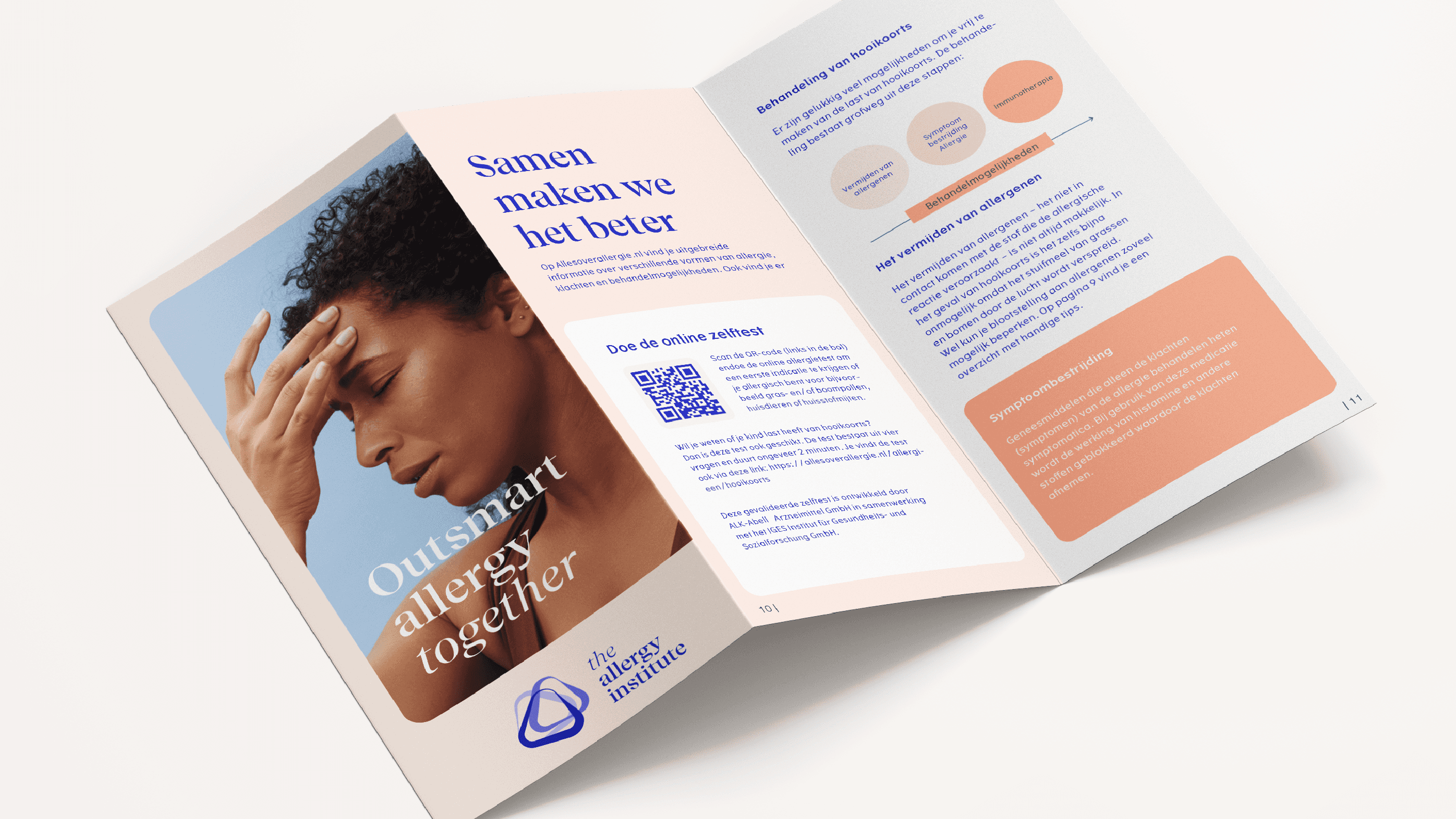
We started with the foundations. Through deep dives with stakeholders and care professionals, we identified three urgent needs: education, connection and awareness. These pillars became the heart of the brand, and informed everything from the positioning and brand architecture to the visual identity and messaging. Together with Arvin Leeuwis and Ingmar Coenen, we translated the brand into a digital platform: an accessible, credible space where knowledge, people and progress come together.
What we did
We started with the foundations. Through deep dives with stakeholders and care professionals, we identified three urgent needs: education, connection and awareness. These pillars became the heart of the brand, and informed everything from the positioning and brand architecture to the visual identity and messaging. Together with Arvin Leeuwis and Ingmar Coenen, we translated the brand into a digital platform: an accessible, credible space where knowledge, people and progress come together.
Made by Ingmar Coenen & Arvin Leeuwis
Made by Ingmar Coenen & Arvin Leeuwis
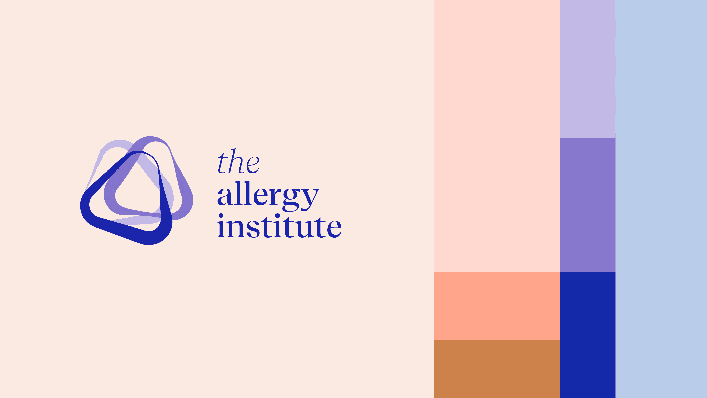
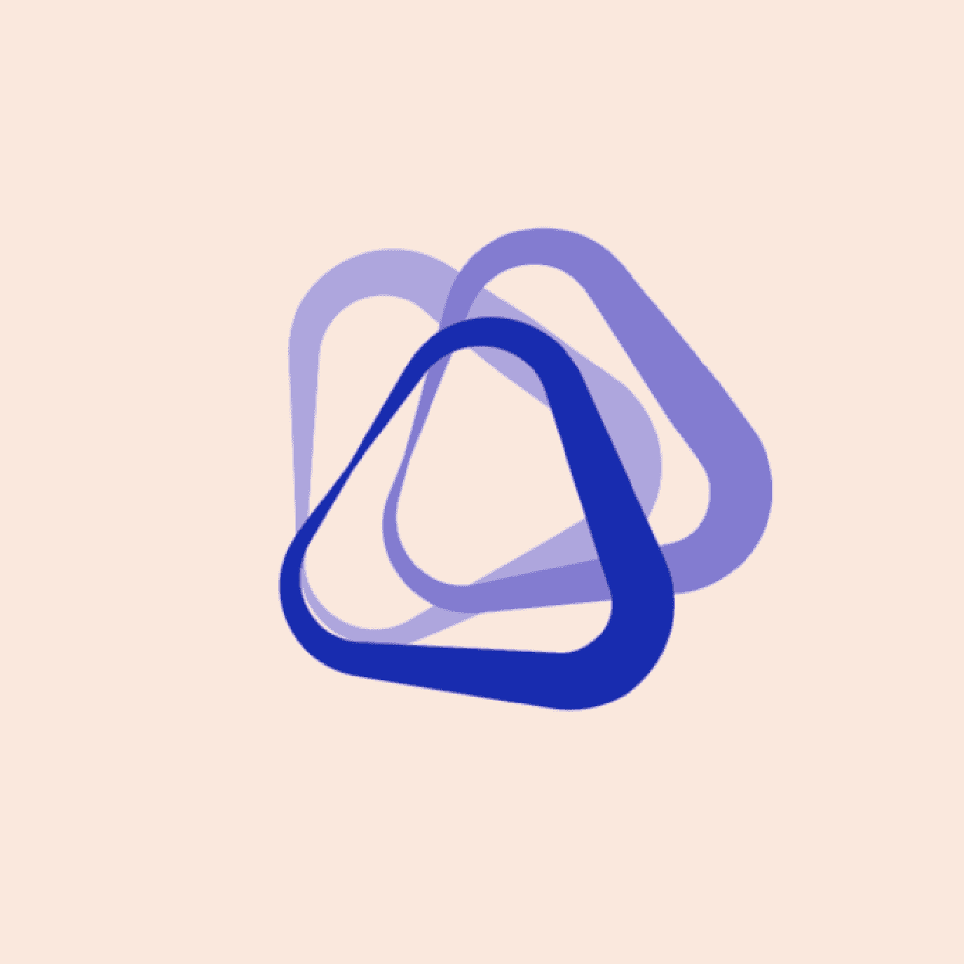
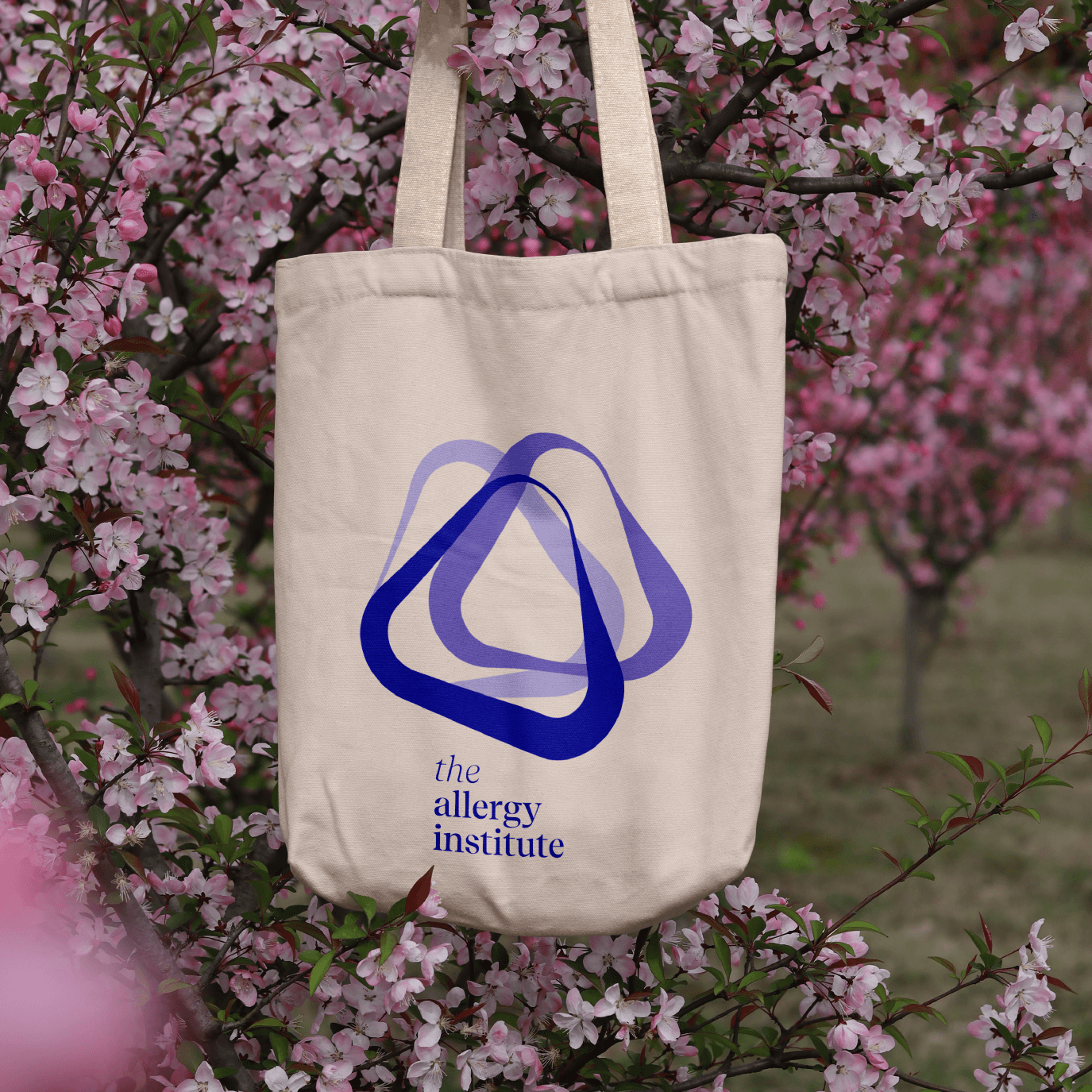
Clarity and connection
The Allergy Institute’s visual identity is clear, warm and intelligent, just like the institute itself. With soft tones, layered colours and a calm rhythm, the design feels open and trustworthy. The interlinking shapes in the logo stand for collaboration: every part contributes to something bigger. The identity doesn’t shout, but connects and supports. Together with Mark David, we created photography that brings this story to life.
The Allergy Institute’s visual identity is clear, warm and intelligent, just like the institute itself. With soft tones, layered colours and a calm rhythm, the design feels open and trustworthy. The interlinking shapes in the logo stand for collaboration: every part contributes to something bigger. The identity doesn’t shout, but connects and supports. Together with Mark David, we created photography that brings this story to life.


Next case